Coordinating group travel introduces ambiguity around budget, preferences, and decision ownership. This project explored how Airbnb could better support shared decision making during the planning phase of group trips.
timeline
2 Weeks (80 Hours)
Role
Product Designer (Solo)
Tools
Figma, FigJam
How might we help groups make travel decisions without friction or guesswork?
the solution
A focused concept that makes group constraints visible early, surfacing shared preferences and price per person to help groups converge on decisions faster.
Shared wishlists
Making group preferences visible
Price-per-person filtering
Aligning budget expectations early
What informed the approach
Research summary
Groups relied on workarounds such as messaging, screenshots, and manual calculations to align on budget and preferences. Price per person and visibility into group sentiment were critical factors in narrowing decisions.
Key product decision
Rather than adding new communication features, I made constraints explicit within existing workflows. Surfacing price per person and shared context reduced back-and-forth coordination. This increased upfront constraint exposure, but reduced prolonged coordination and delayed decisions later in the flow
Execution highlights
The following screens show how these decisions were integrated into Airbnb’s existing design system.
Usability learnings
Testing informed the following refinements:
1
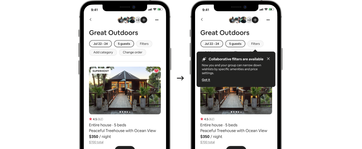
Users overlooked filters, so visibility of it was increased.
2
Pricing was unclear, so the labeling was simplified.
3
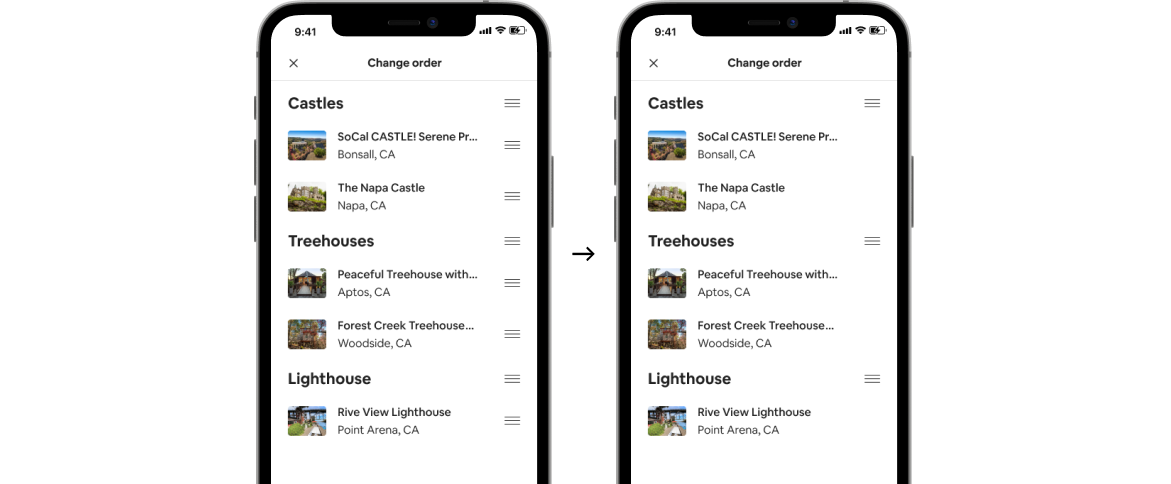
Interaction order confused users, so complexity reduced.
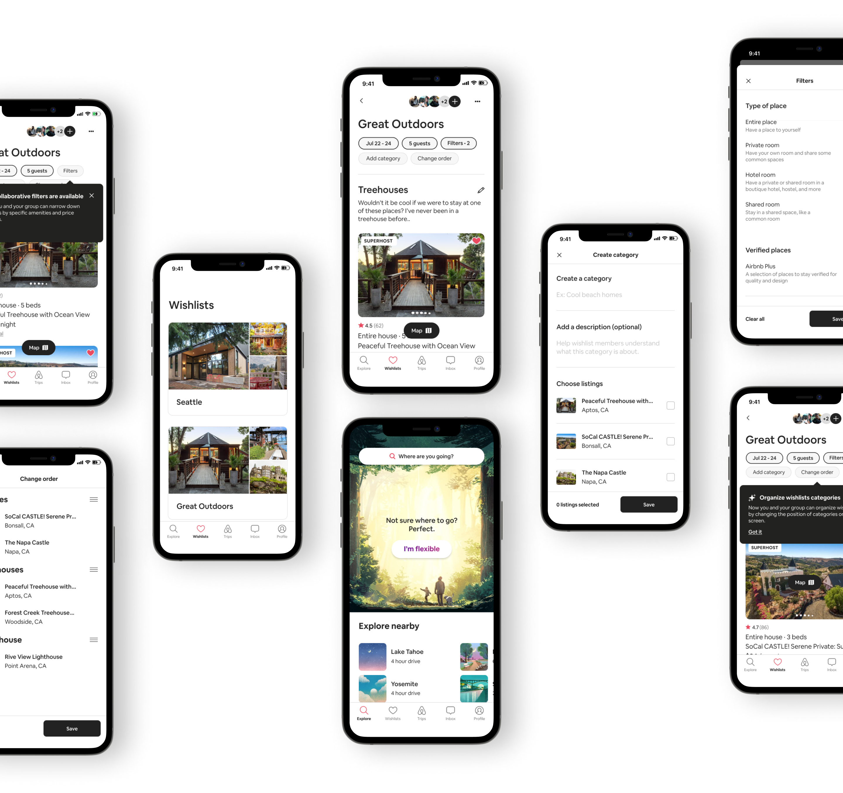
Collaborative Filters
Making group constraints visible during filtering
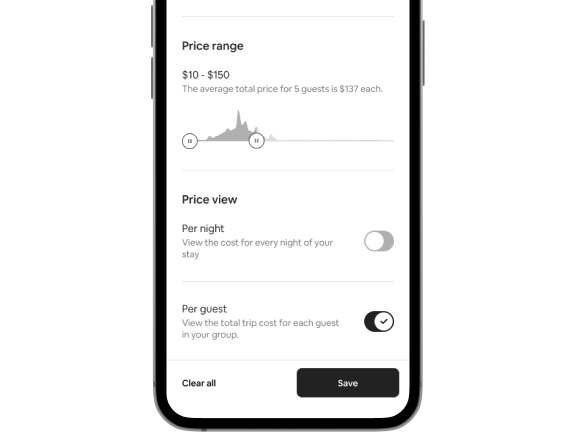
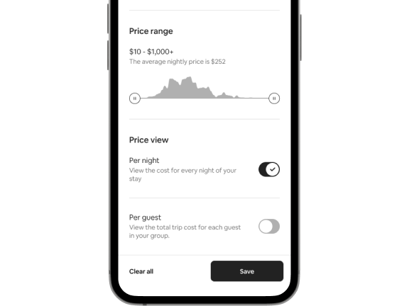
Price per guest
Details were moved closer to the price range controls after testing showed users missed the calculation. This change made budget constraints easier to understand while browsing.
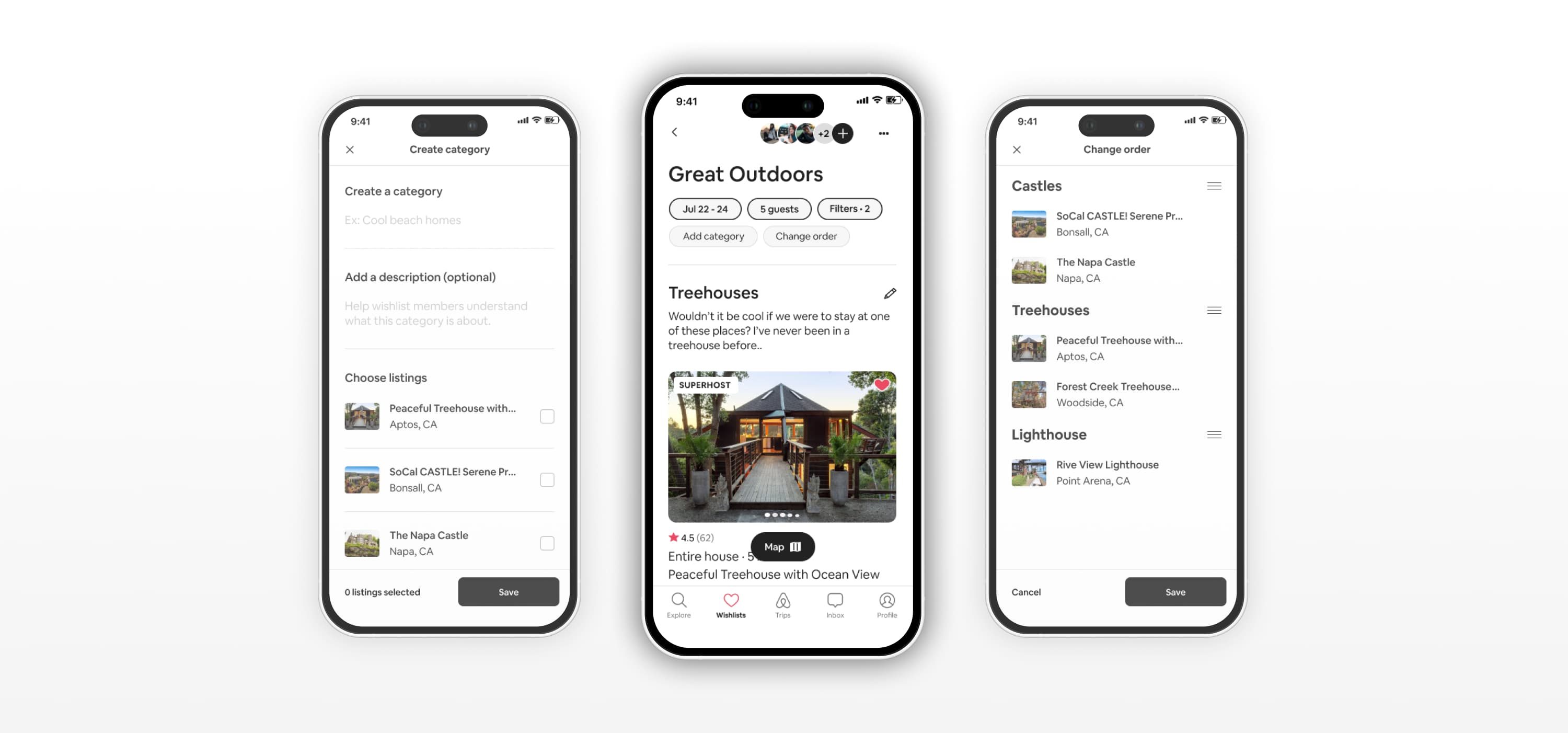
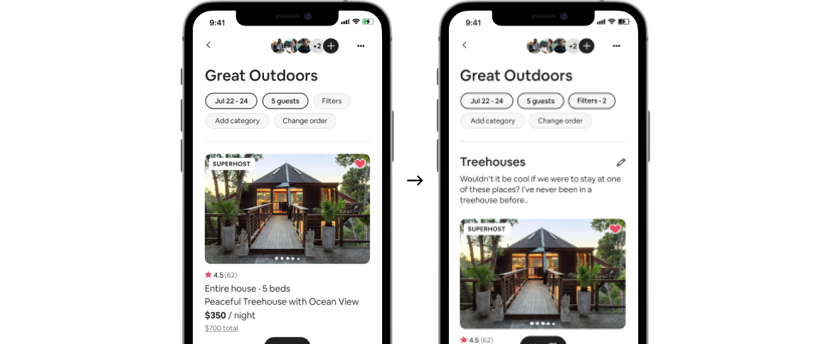
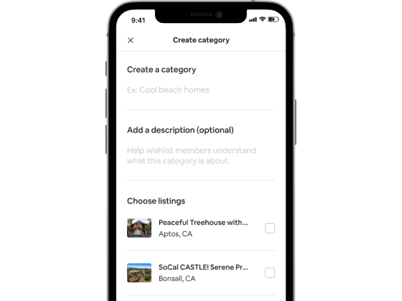
Wishlist categories
Introduced to help groups cluster preferences and narrow options without relying on external coordination.
Category order
Reducing reordering complexity to support faster decisions
outcome
By surfacing budget and preference constraints early, the concept reduced back-and-forth coordination and helped groups converge on decisions with fewer iterations.

.png)