A focused iOS MVP exploring local, interest-based connections.
Existing social networking products often rely on low-context interactions that make it difficult for users to assess compatibility or move conversations forward. Init explores an alternative approach: supporting local connections through shared interests and real-world context, with an emphasis on clarity and intentional interaction.
timeline
2 Weeks (80 Hours)
Role
Product Designer (Solo)
Tools
Figma, FigJam
How might we help users assess compatibility before connecting?
The solution
A focused iOS MVP centered on interest-based discovery and local events, designed to encourage intentional interaction rather than passive scrolling.
These features exist to support earlier compatibility decisions, not to increase discovery volume.
feature overview
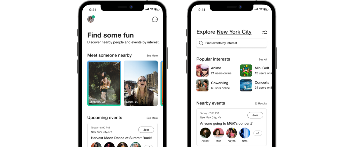
Interest-based discovery for people and events
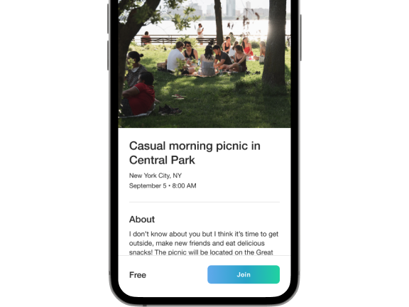
Low-pressure event creation
Events provide shared context that helps users assess compatibility before connecting.
What informed the approach
Research summary
I spoke with six participants to understand how people decide whether to connect with others locally. Research showed that early interactions often lacked enough context for users to assess compatibility, leading to stalled conversations or mismatched expectations. Shared interests helped discovery, but were not sufficient on their own for deciding to connect.
Key product decision
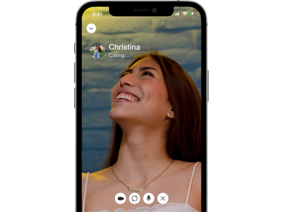
For the MVP, I prioritized video calls over messaging. While messaging is common in social apps, it often delayed or distorted early impressions. Video added friction upfront but helped users assess compatibility faster and reduced low-quality interactions.
Product direction
This decision shaped a focused set of core interactions:
1
Interest-based discovery to provide initial context for users
2
Video first connections for early compatibility assessment
3
Local events to encourage low-pressure, real world interaction
Execution highlights
The following screens show how the product direction translated into a focused MVP experience.
Usability learnings
Testing informed the following refinements:
1
Clarified optional fields after onboarding hesitation.
2
Reduced visual interest density to improve content scannability.
3
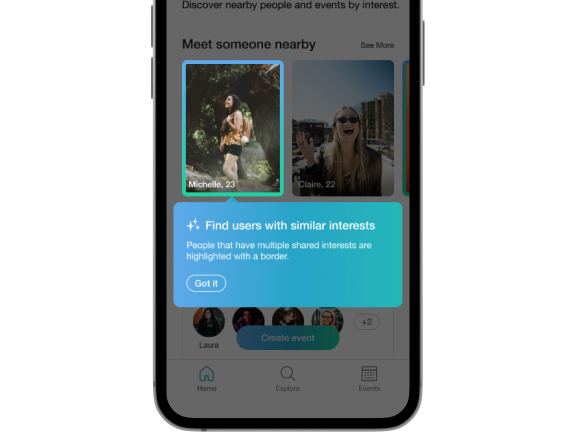
Added context explaining why profiles were highlighted.
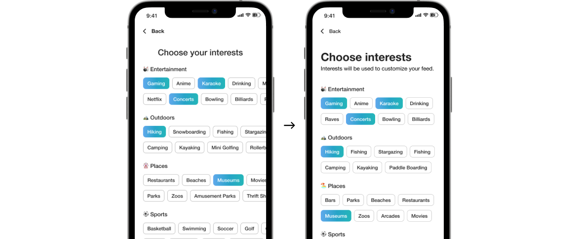
Choosing interests
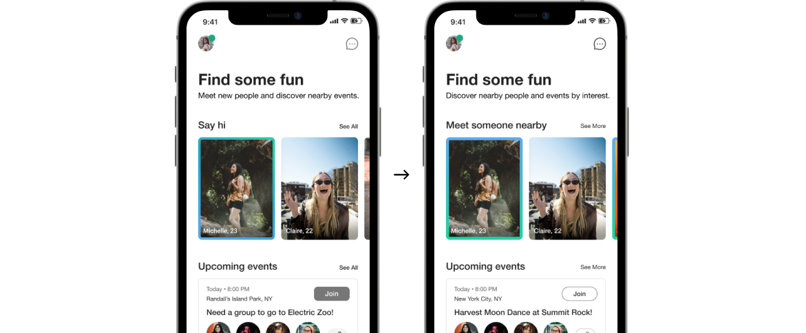
Reducing horizontal scrolling and improving clarity
Similar interests
Testing showed users didn’t understand why certain profiles were highlighted. A notification was added to explain shared interests and make recommendations easier to trust.
Genuine connection
Text-based context often led to inaccurate first impressions. Video chatting was used as the primary way to connect, allowing users to assess compatibility before meeting.
Relevant feed
Clarifying section intent and simplifying event cards
outcome
The MVP accepts higher upfront friction in exchange for faster, more accurate compatibility decisions, reducing low-quality downstream interactions.
.jpg)


.png)